

Katina Magazine: a magazine experience for librarians
An editorial reading experience for a library-focused magazine: our second magazine, and the first with its UX built from the ground up.
Role: UX and front-end developer
The problem
Katina is a magazine for librarians, so it needed to feel editorial rather than like a journal archive, while still running on the shared publishing platform. It was our second magazine, but the first whose UX was built from the ground up, from designs created by a design agency, and the first built to be accessible from the outset.
What I did
- Built the front end from the design agency's designs, with accessibility a requirement from the start rather than a later fix.
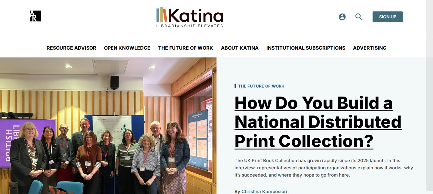
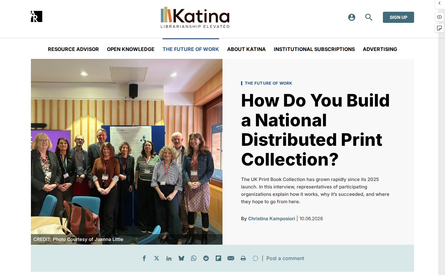
- Built each article with a split opening: a large photograph on one side and the section label, headline, standfirst and byline on the other, so the first screen reads like a cover story.
- Built the main navigation around the sections of the magazine, such as Resource Advisor, Open Knowledge and The Future of Work, and marked the current section.
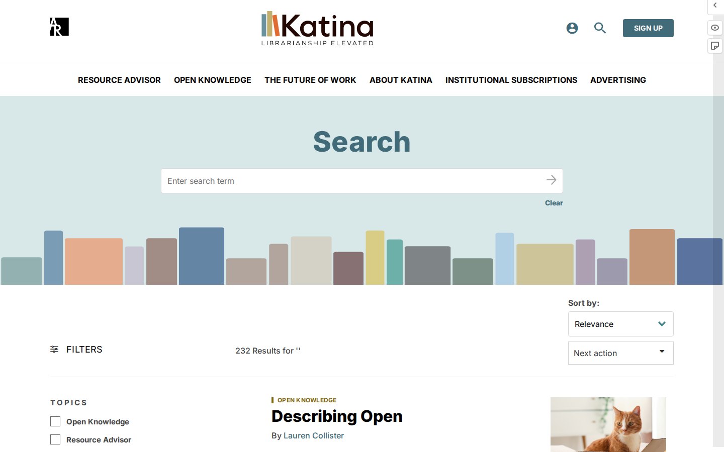
- Built a search page with a colour-block header, topic filters, a result count and sort controls, so a long result list stays scannable.
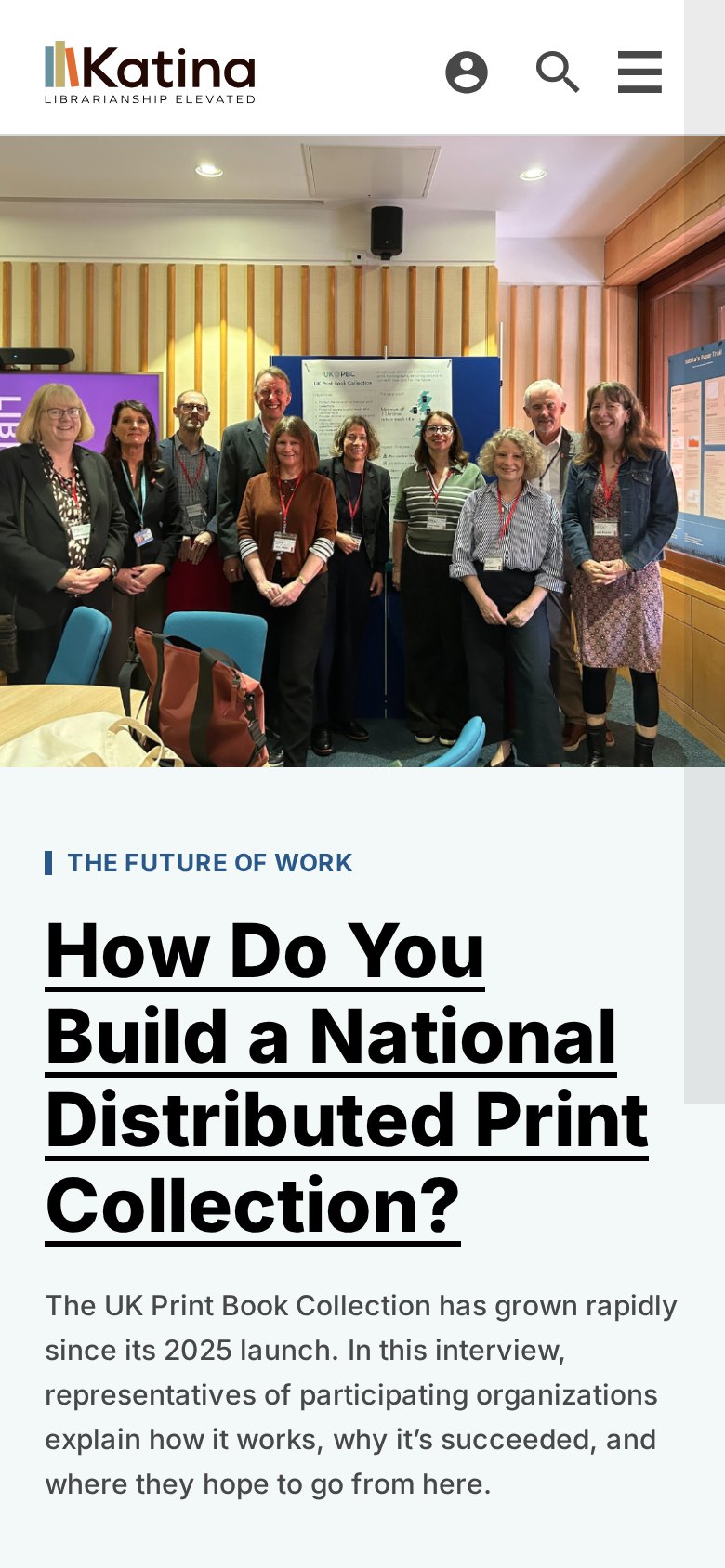
- Kept the header compact on phones, with the section menu behind a single button and a dismissible newsletter prompt.
- Paired the reading experience with a drag-and-drop block editor so editors can lay out articles themselves.
The outcome
Widely praised within the library and information science community for bridging the gap between academic librarianship, commercial vendors, and open-access advocates. It maintains an accessible, engaging tone while tackling complex infrastructure and economic questions in publishing.